A System That Detects Attention Decline and Reflects It Before Self-Blame Begins
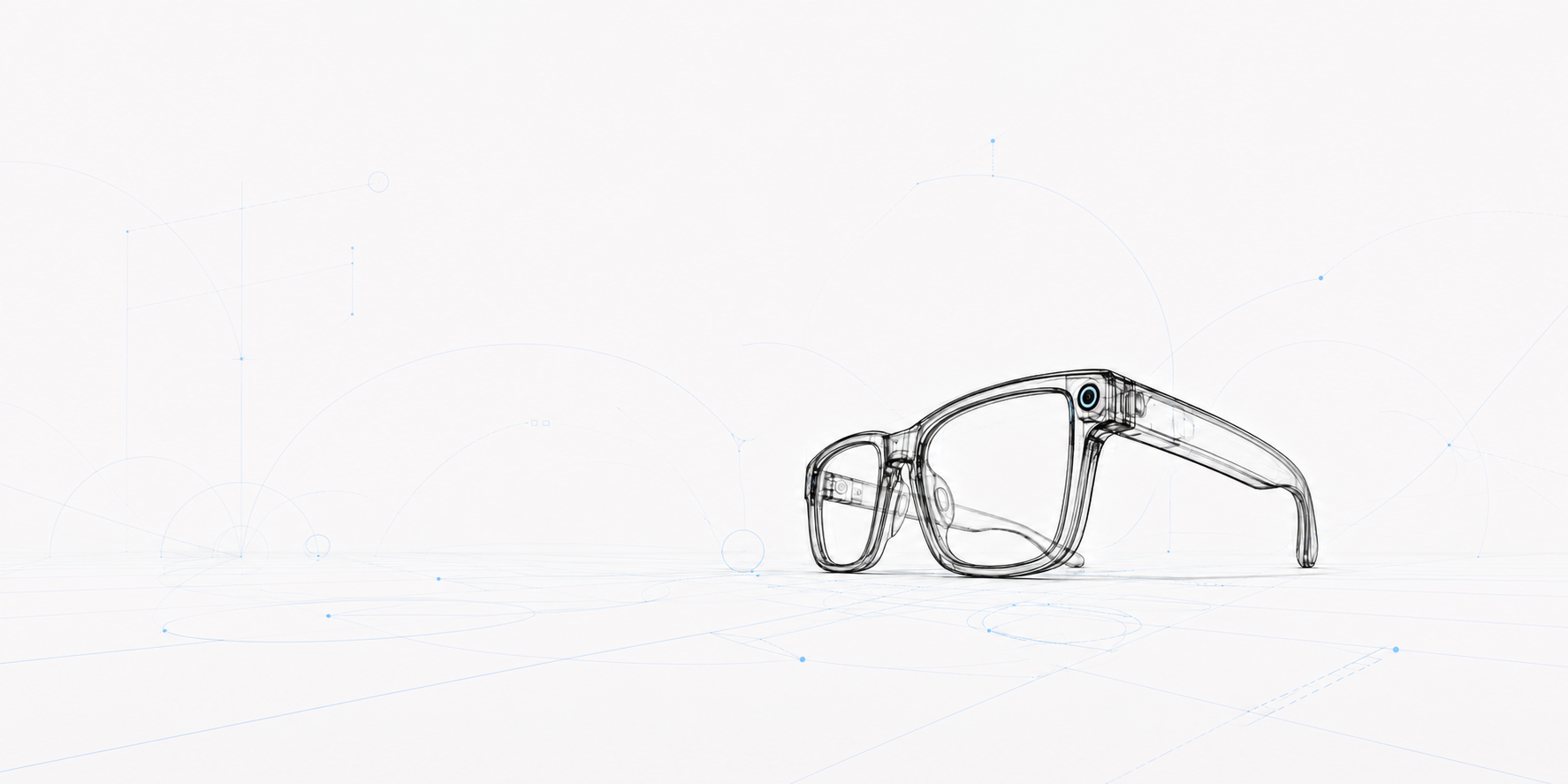
OVERVIEW.
Modern life keeps people under a relentless drive to keep up. Many work exhaustively and consume information not out of curiosity, but from a quiet anxiety of falling behind. As cognitive fatigue builds, efficiency declines; focusing during work becomes an uphill battle, and switching off at night feels nearly impossible. This growing rift between effort and outcome often traps individuals in a cycle of anxiety and self-blame.
To cope, many turn to traditional productivity tools that rely on rigid control, blocking websites, tracking hours, and forcing discipline. Yet, when these brute-force methods inevitably fall short, they leave users feeling more guilty than supported.
As the sole end-to-end product designer on this project, I led the journey from problem framing and user research to UX/UI design and system architecture. Lumo takes a radically different approach: it treats focus not as a behavior to be forced, but as a natural, fluid rhythm.
By leveraging smart glasses to non-invasively sense eye blink patterns and heart rate variability (HRV), Lumo translates complex physiological signals into clear, intuitive visual insights within the app—all while strictly safeguarding user privacy. By revealing these personal data patterns over time, Lumo empowers users to understand their body’s response to stress, encouraging them to make intentional choices about rest. The result is a healthier, more sustainable relationship with work—one that replaces exhaustion with self-awareness.
Role: Product Designer
Year: 2025 - 2026
Problem Statement.
Traditional productivity tools reduce deep work to a black-and-white metric: discipline or failure. When timers and website blockers fall short, users naturally blame themselves, ignoring that diminished focus is often their body’s cry for rest.
Without objective insight into their physiological limits, users respond by pushing harder—trapping themselves in an anxious feedback loop where rising stress further erodes attention, effort feels heavier, and productivity plummets. The core failure of existing tools isn't a lack of features; it is that they enforce rigid control instead of fostering self-awareness, turning wellness into a source of frustration.
Solution.
Through research, eye blink patterns and heart rate variability were identified as signals that reflect how a person’s focus changes over time. Instead of treating these signals as raw data, the product translates them into an understandable view of the user’s focus rate across a session or day.
By seeing these patterns, users gain context for moments when efficiency drops. Rather than assuming a lack of ability or discipline, they can recognize when reduced focus is linked to accumulated strain or a need for rest. This shift in understanding changes how users respond. Rest becomes a deliberate decision instead of a source of guilt, and effort is applied more intentionally rather than through pressure.
By helping users understand their state before pushing further, the product supports more balanced pacing and allows productivity to recover naturally after rest, instead of being forced under stress.
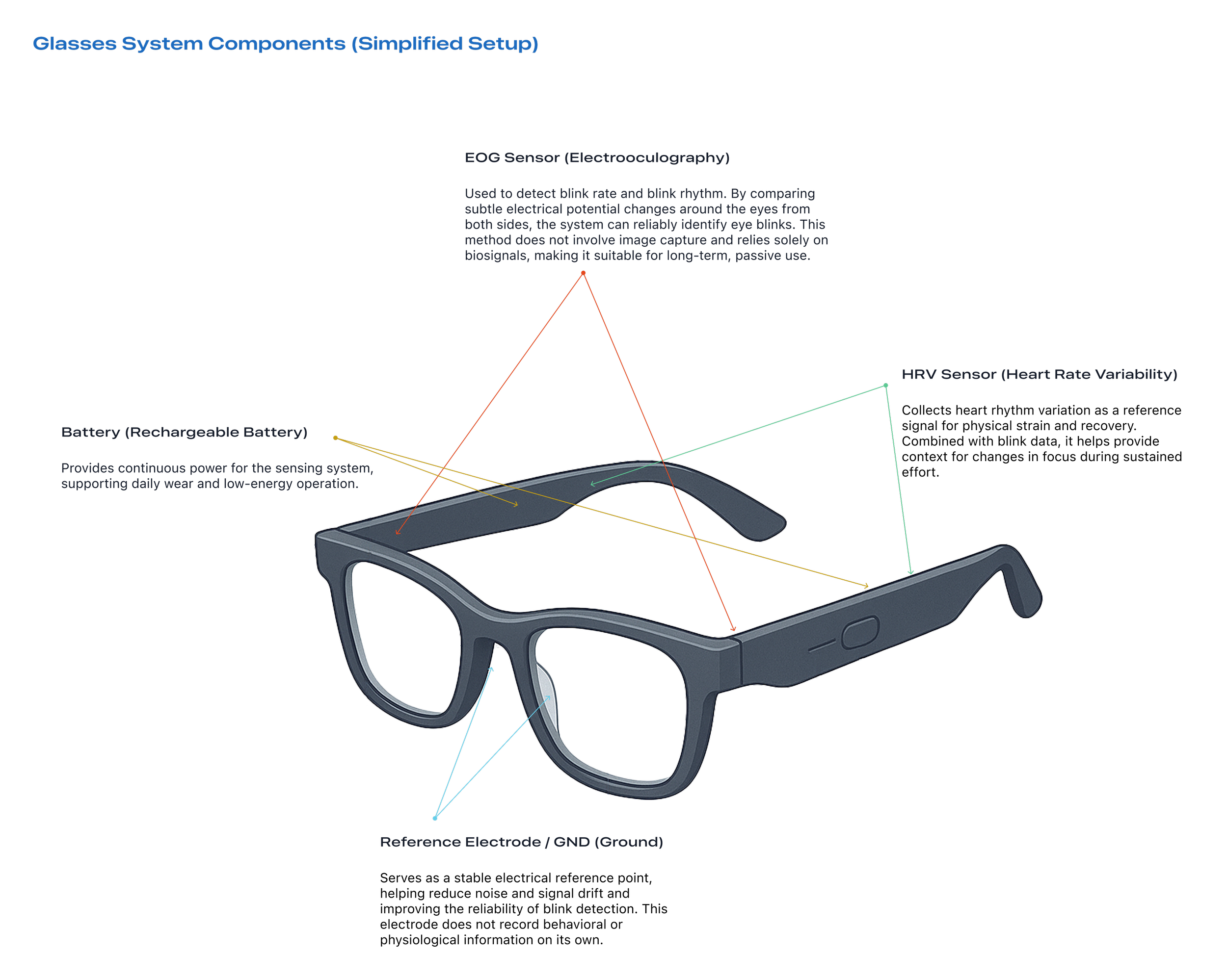
From Sensing to Understanding.
The glasses capture changes in the body, but these signals do not carry meaning on their own. To help users truly understand what is being sensed, the system passes this data to the app, where it is organized and presented through visualization.
Rather than exposing raw measurements, the app translates these signals into patterns of rhythm and change. This allows users to see how their attention builds, softens, and recovers over time, turning subtle physiological signals into something that can be read, reflected on, and understood.
This screen marks the moment when sensing begins, and it is always initiated by the user. The glasses do not collect data continuously in the background. They only become active after the user explicitly chooses to start a session.
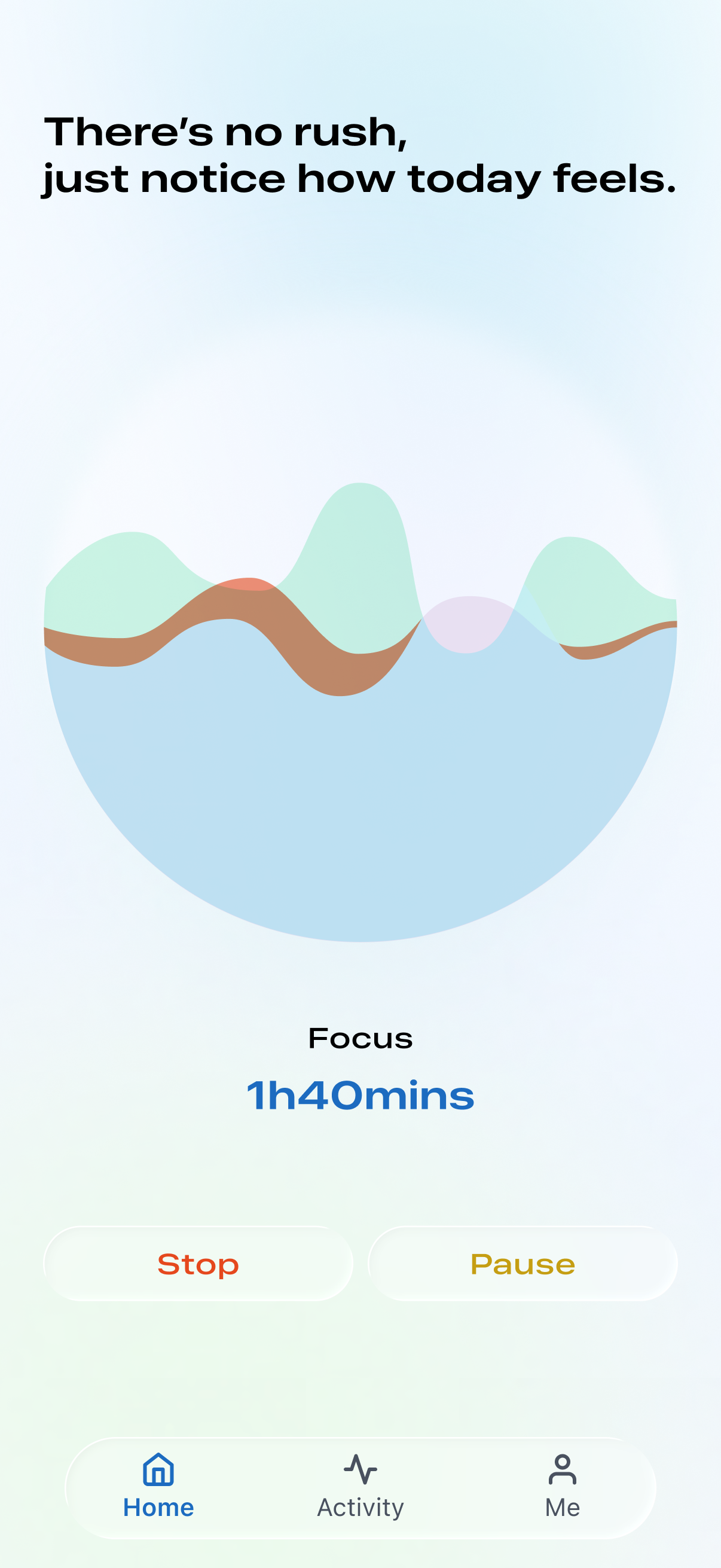
By making the start state visible and intentional, the design reinforces a clear boundary between everyday wear and data collection. Users are aware of when sensing is happening and remain in control of when it stops. This approach avoids passive surveillance and ensures that attention data is gathered with consent, not assumption.
The language and visual tone of this screen are deliberately calm and unhurried. Rather than signaling productivity or urgency, the interface invites presence. The goal is to help users ease into a focus session without pressure, while knowing that their data is only being read when they choose to engage.
This screen is designed for reflection rather than real-time action. Instead of showing raw data or moment-by-moment alerts, it offers a calm overview of how attention unfolded across the day.
The interface avoids language of success or failure, emphasizing that focus does not follow a straight line but moves in waves. This framing helps users step back from individual moments and see their experience as a whole.
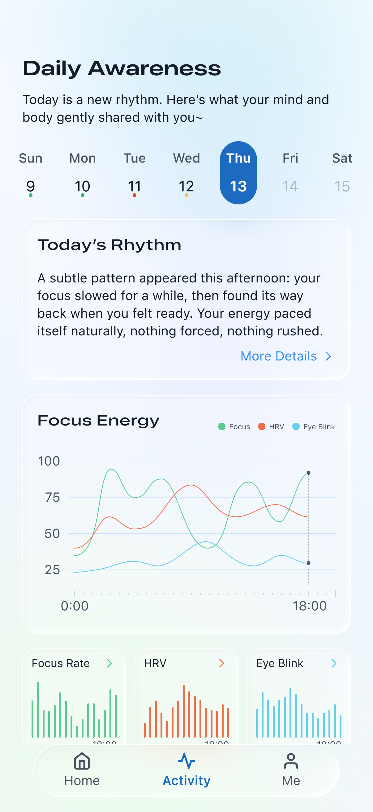
The Today’s Rhythm summary is generated by AI based on patterns observed in eye blink and HRV signals throughout the day. Rather than explaining the data directly, it translates these patterns into a short narrative that describes how effort shifted and recovered, helping users make sense of their experience without feeling judged or corrected.
Below, the Focus Energy visualization brings multiple signals together. Focus, HRV, and eye blink are shown side by side to provide context, not comparison. No single metric is treated as a definitive answer. Instead, users are encouraged to notice relationships between signals and how their state changed over time.
By presenting data in this way, the screen supports awareness without pressure. It allows users to understand their own patterns, recognize moments of strain or recovery, and reflect on how attention responds to sustained effort—without turning observation into another form of performance tracking.
This screen expands on the Today’s Rhythm summary, offering a more detailed reflection on how attention shifted throughout the day. Rather than presenting new data, it slows the experience down and gives users space to read what was already sensed.
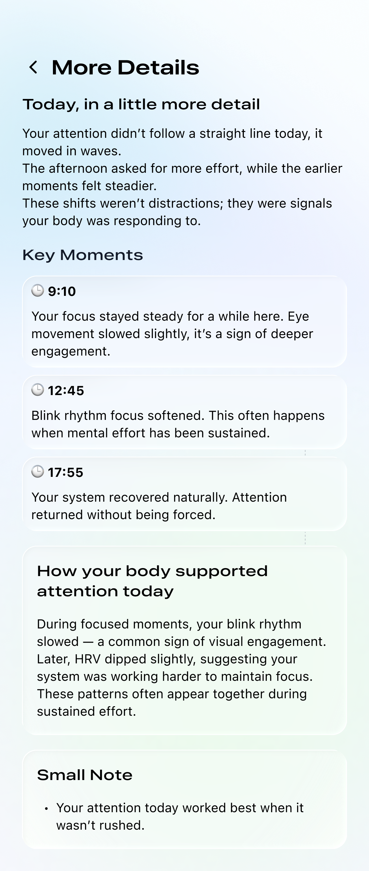
The Key Moments section breaks the day into a few meaningful points in time. These moments are selected based on noticeable shifts in eye blink and HRV patterns. Each entry simply describes what changed and how the body responded. The AI does not judge whether attention was focused or unfocused, productive or inefficient. It does not treat loss of focus as something wrong. Its role is to describe what happened, as it happened.
Below, How your body supported attention today connects individual moments back to broader patterns. The AI explains how signals often appear together during sustained effort, helping users understand context without telling them what they should have done differently.
Across this screen, the AI acts as a translator rather than an authority. It reflects the truth of the day in clear language, allowing users to see their experience without pressure to fix, optimize, or perform.
Key Takeaways.
I learned that design decisions are strongest when they are guided by what the system should not do, not just what it should include.
I learned that translating complexity into something readable is more impactful than adding more functionality.
I learned that giving users control over when a system is active fundamentally changes how trustworthy it feels.
I learned that language, tone, and pacing are as important as visual layout when designing experiences around pressure and attention.
I learned that a product can be supportive without being directive, and that restraint can be an intentional design choice.
I learned that designing systems, rather than isolated screens, requires thinking across hardware, software, and interaction boundaries.